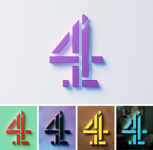
Channel 4 is today launching a major brand redesign. Masterminded by 4Creative, Channel 4’s in-house creative agency, the new identity is brave, bizarre, and striking.
Shot by Jonathan Glazer, the idents tell the story of the channel’s blocks being discovered in caves, mined from the ground, and refined in labs. They’re natural, elemental curiosities.
“The idents present the blocks as kryptonite-like. They tell the story of their origin and how they have a powerful impact on the world around them. Just as Channel 4 does. It is a story that we shall build on.”
It’s Nice That: New Channel 4 identity by creative dream team of 4Creative, Jonathan Glazer, Neville Brody and DBLG
Two new typefaces have been designed by Neville Brody. The first is Chadwick, a rounded, warm, corporate typeface. Its forms are heavily geometric and designed for readability. The second typeface is Horseferry, an unusual, disruptive display text. Horseferry uses the basic forms of Chadwick, but blends in the blocks from the ‘4‘ logo.
See also
- The untold story of the British Rail logo — “I was a lettering artist, I wasn’t a designer.”
- Neue Haas Unica — an attempt to create the ultimate sans-serif – a hybrid of Helvetica, Univers and Akzidenz Grotesk.
- Narita International Airport Terminal 3 — for the exclusive use of low-cost carriers, and was constructed with a budget of approximately half of what a project this size would usually get.
- Sweden Sans: a national typeface — a “modern” but edgy typeface with some local tweaks.


Pingback: 4creative | Shaleen O'Neill