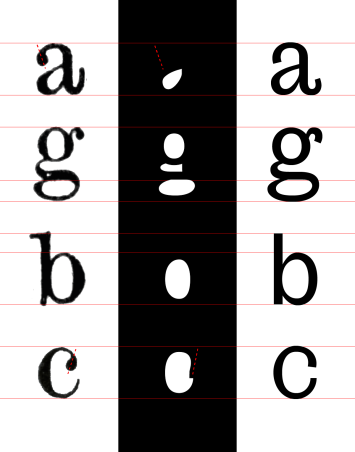
“We found this old anatomy book (from which the name, Anatomia) printed in the early 20th century, set in this ugly scotch face with exaggerated details that made it work in small sizes. Our idea was to bring the skeleton, the proportions and some characteristic aspects into a grotesk–formula based typeface, being that the historical evolution of these modern faces.”
“Big serifs and strong details for the small sizes would become characteristic elements in big sizes.”
“The design of the typeface followed the rule of keeping the counterform shaped as the original design, while building the outside of the letters in a more geometric way. What comes out of this process is a grotesk typeface with a characteristic dynamism through the texture, with an accentuated stroke modulation.”
See also
- Recovering The Doves Type from the bottom of the Thames — In 1916, the Doves Type was seemingly lost forever after it was thrown into the River Thames. Almost 100 years later, and after spending three years making a digital version, designer Robert Green has recovered 150 pieces from their watery grave…
- A detailed look at Apple’s new San Fransisco typeface — So is San Francisco really the perfect system font for Apple’s products? It’s complicated.
- Making of a typeface: GT Sectra — originally designed for the long-form journalism magazine “Reportagen”
- Neue Haas Unica — Monotype’s revival of a typeface that has attained almost mythical status in the type community. Unica was an attempt to create the ultimate sans-serif – a hybrid of Helvetica, Univers and Akzidenz Grotesk.
(via)


