
Monotype introduces Johnston100
A contemporary update to Transport for London’s Johnston typeface, marking the centennial of its use across the London bus, rail and Underground systems.
First commissioned in 1913, British artist and calligrapher Edward Johnston was tasked with creating lettering with “bold simplicity” that would have clear roots in tradition, but wholeheartedly belong to the 20th century.


“Our brief to Monotype was to go back to the original principles of Johnston, to reflect on the way the font is now, and see what we might have lost in its 100-year journey. We didn’t want to redesign it, but we did know that certain things, for various reasons, had changed. Some of the lower case letters, for example had lost their uniqueness.”
TfL Head of Design Jon Hunter

“As social media has become more important, hashtags and ‘@’ signs are more important – Johnston never designed those because they were never needed. Mainly we wanted to make Johnston relevant and fit for today’s purpose.”
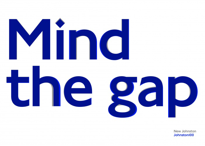
Design Week: Over the last 100 years, Johnston became narrower and more mechanical as functionality took precedence over design. Monotype has opted for a wider face, which better reflects Edward Johnston’s original drawings and gives it more of a relaxed feel.


“It was very important to TfL that we add the extra-thin weights, because of today’s digital trends. We were able to capture the contemporary trend and the fashion of having something very light and very elegant, but because we are still using the original structures, we were able to maintain the soul of the typeface.”
Nadine Chahine, UK type director at Monotype
Designology


I visited the Designology expedition at the London Transport Museum a few weeks ago and took some photographs of the design sketches for the 70’s New Johnston typeface.
See also
- The untold story of the British Rail logo — “The designers at DRU were given the brief and, to my knowledge, it didn’t satisfy Milner. So he threw it open to the rest of the studio, six or seven people. I just happened to think of this symbol.”
- History of Helvetica — A fascinating history of the creation and adoption of this ubiquitous Swiss font.
- A detailed look at Apple’s new San Fransisco typeface — So is San Francisco really the perfect system font for Apple’s products? It’s complicated.
